
What a box of watercolours taught me about knowing your customer, cultural differences and the details that make – or undermine – a premium brand.
Today, I would like to regale you with a tale about watercolour paints, cultural differences, translations and the absolute necessity to know your customer.
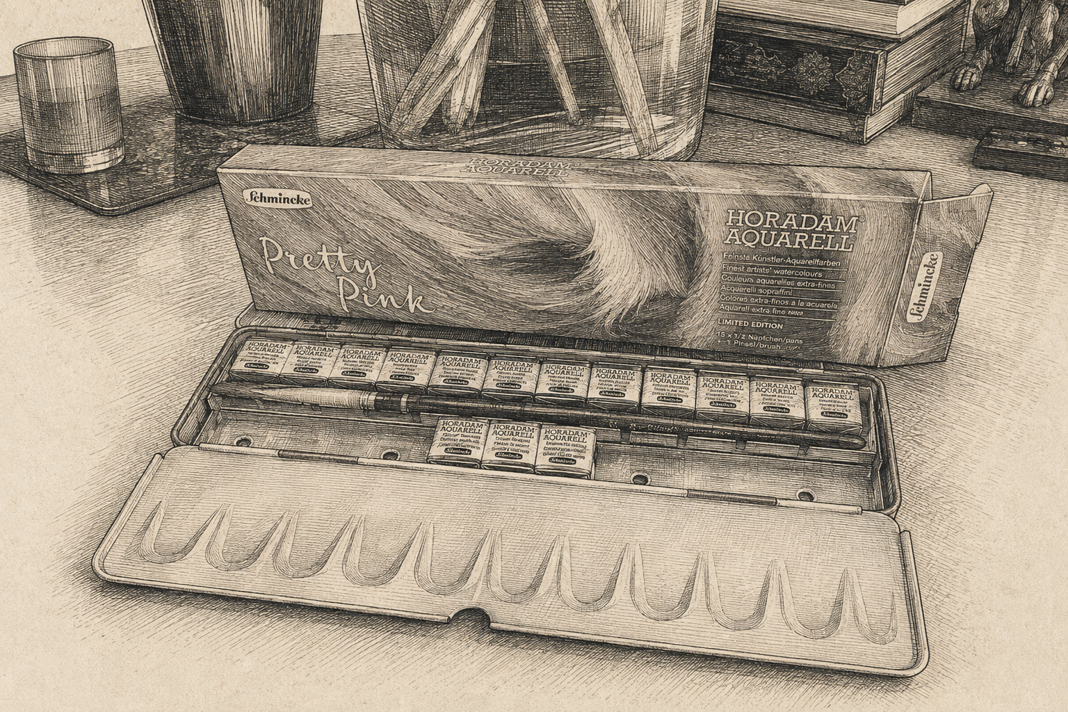
This story starts with the purchase of a new professional watercolour palette that I absolutely did not need, but had lusted over for some time. The palette is called Pretty Pink, and it’s from the respected German manufacturer Schmincke.
So far, so good.
The palette was on offer – these are not cheap watercolours – and even with a discount, you would be surprised by how much you have to pay for just 15 half-pans of colour. The answer is over £2 per gram.
When I came clean to my husband that I had made this completely superfluous purchase, I justified it by telling him that the offer was really too good to miss.
On reflection, we both agreed that the “Pretty Pink” special edition was probably cheap because it hadn’t quite hit the market right. It was playful and eye-catching, but the people likely to buy these paints are either professional watercolour artists or seriously committed amateurs.
I don’t know what research went into identifying the ICP – Ideal Customer Profile – for this special edition, but I’m not convinced the Venn diagram of professional watercolour artists on one hand and lovers of Barbie pink on the other yields an enormous target market.
Still, I was happy about that because I was getting the paints at a price I could “reasonably” justify to myself.
We will return to the ICP shortly.
When helpful becomes unhelpful
As soon as the parcel arrived, I opened it with the impatience and glee of a five-year-old opening a Christmas present. It all looked beautiful and expensive. Even the paint wrappers and brush matched the Barbie pink of the tin.
What’s not to like?
Inside was a swatch card. For those not initiated into watercolours, swatching is usually one of the first things you do with new paints. The colours in the pans are so dark and concentrated that you cannot really tell what they will look like on paper.
Providing a good piece of watercolour paper, neatly divided into spaces for each colour, is therefore genuinely useful.
Brownie points for Schmincke.
Then I turned the card over. There were extensive instructions on how to use it, in five languages. Goodness, I thought. That’s rather unusual.
I have never before seen instructions explaining how to use a swatch card properly. Most buyers would probably ignore them, but as a marketer I can’t help myself. I read this stuff because I want to understand what other companies are doing.
And then it hit me. Who, exactly, were these instructions for?
Return to the ICP: professional watercolour artists and seriously committed amateurs. These people don’t need instructions explaining how to swatch paint, much less how to use watercolours properly.
I am quite certain the intention was helpful. But to me, the result felt patronising. That subtle distinction matters enormously when you are trying to know your customer.
One ICP, different cultures
At this point I was laughing hard enough to attract my husband’s attention. His reaction was immediate: “Oh, well that’s quite normal for a German company. You would expect them to be super precise and provide instructions. It’s just what they do.”
He spent most of his career working with Germans and has a profound understanding and respect for how they work.
Which made me think again about the ICP.
The instructions may have been perfectly appropriate for one subset of Schmincke’s customers while being interpreted quite differently by another.
These cultural differences are something I have spent thirty years trying to explain in marketing.
Companies – particularly technology companies – often look for the lowest common denominator when marketing across multiple countries. Yet Europe is made up of wonderfully different cultures, expectations and habits.
Something intended as reassuringly thorough to a German customer may feel patronising to a French one. And an English customer may simply see the funny side and make a joke of it.
As a French national who has lived in England for decades, I somehow managed to be slightly offended and then laugh about it.
Knowing your customer therefore isn’t simply about defining an ICP on a slide. It is about understanding that customers who fit the same commercial profile can still interpret the same message very differently.
And then there was the translation…
The instructions were provided in five languages, four of which I speak. I first read the English version. That’s when I got a real belly laugh.
It was bad enough that I initially wondered whether the product had been manufactured in China. No offence meant to anyone from China reading this — it’s simply that poor English translations on imported products have become legendary. I have even been known to keep particularly entertaining examples so I can read them again when I need cheering up.
Then I read the French version. It was worse.
Now, don’t get me wrong. Translation is hard. I speak several languages fluently – smug mode activated – but I am utterly rubbish at translation.
Good translation requires skill, patience and attention to detail. It also requires you to be a good copywriter in both the language you are translating into and the one you are translating from.
These days, AI has made that process considerably easier. I am often asked to translate to and from French, and AI means I can now produce a much better starting point, much faster — something I would have metaphorically killed for when I started work.
So naturally, I experimented.
I copied the original German into two different AI tools. Within seconds, I had a considerably better French translation than the one printed in the leaflet.
It wasn’t perfect. It wasn’t going to win a literary prize. And a professional translator would undoubtedly have produced something better. But it was pretty damn good.
Which raises another question. If better was so easy to achieve, why hadn’t a premium brand achieved it?
Premium brands need premium details
This is where the little pink palette becomes rather more interesting to me as a marketer.
These watercolours are aimed at serious artists. Schmincke is a premium brand selling a premium product at a premium price. That creates an expectation that extends beyond the paint itself.
Packaging is part of the brand, as are instructions and translations. Every small detail contributes to the customer’s perception of what that brand stands for.
If you decide that instructions are important enough to write, translate and print, then surely they are important enough to do properly. Otherwise, the money saved on translation risks undermining the impression of quality that you have worked so hard to build.
And that brings me back, one final time, to knowing your customer.
Knowing your customer isn’t simply knowing who might buy your product. It means understanding their level of expertise, their expectations, their culture and the signals they use to judge whether your brand is worthy of their trust.
Sometimes the smallest details say the most.
For the record, the paints themselves are genuinely very good. The leaflet hasn’t put me off them in the slightest, and I am looking forward to spending the weekend playing with them and producing my usual average amateur artwork.
So this isn’t a complaint about Schmincke — not in the slightest.
It’s a cautionary tale about staying true to your brand, understanding the unique aspirations of your customers, and the perils of saving money in the wrong places.
And if Schmincke happen to be listening, my message is simple: either ditch the instructions, or make them a piece of art worthy of your brand.
Leave a Reply